Teammates E-Portfolios:
https://srinidadi.quarto.pub/eport/
https://nickcolosimo.quarto.pub/nicholas-colosimo/
https://molly-lingenfelter27.quarto.pub/molly-lingenfelter/about.html
https://diana09.quarto.pub/diana-batista/
Motorcycle Crash Analysis

Our project analyzed a Connecticut statewide motorcycle crash data set covering the years 2015–2024.
The data set includes the date, time, geographic coordinates, crash severity, weather and roadway conditions, and the day of week for every recorded motorcycle crash. This level of detail allowed us to explore temporal trends, severity patterns, behavioral factors, and spatial clustering throughout the state.
When Did Most Motorcycle Crashes Happen?
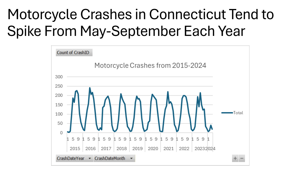
(Time series using the crash date column)
Why This Question Is Interesting
Understanding when crashes occur most frequently helps transportation agencies anticipate high-risk periods, allocate patrol resources, and design targeted rider safety campaigns. Motorcycles are highly seasonal in many states, making timing a critical factor.
How We Used Excel
We imported the dataset into Excel, extracted the crash date column, and created a time-series line graph showing the total number of monthly crashes from 2015–2024. We used grouping, pivot tables, and smoothing to highlight seasonal cycles.
How We Developed the Visual
We tested weekly and monthly aggregations and determined that hourly counts created the cleanest visualization. We labeled summer peaks, minimized gridlines, and formatted the graph to emphasize year-to-year patterns.
What Is the Most Common Crash Severity?
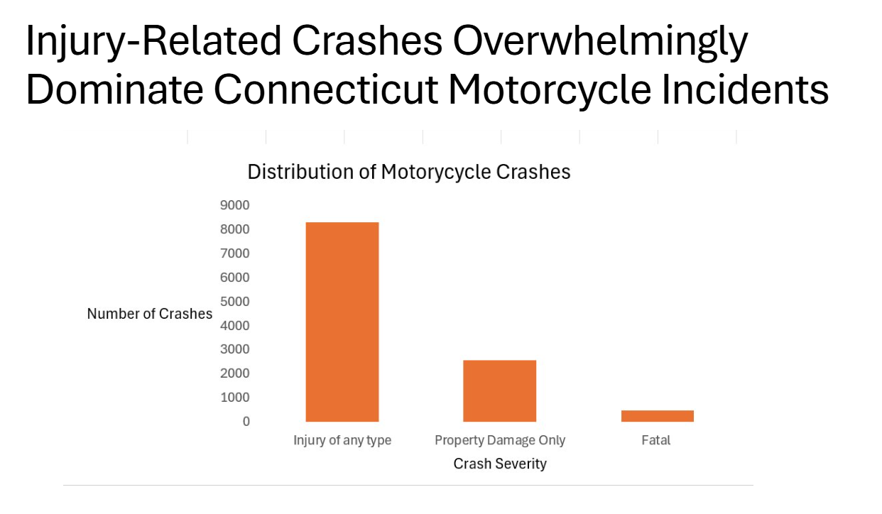
(Bar chart using the CrashSeverity column)
Why This Question Is Interesting
Crash severity reveals how dangerous motorcycle collisions tend to be in Connecticut. Identifying the most common severity category helps policymakers prioritize safety improvements, EMS preparedness, and roadway design.
How We Used Excel
We filtered the CrashSeverity column, counted occurrences of each category (Property Damage, Minor Injury, Serious Injury, Fatal), and built a bar chart to compare frequencies.
How We Developed the Visual
We chose a simple vertical bar chart for clarity and applied consistent colors for severity categories. To avoid clutter, we sorted bars from most to least frequent.
What Is the Distribution of Crashes by Hour of the Day?
 (Histogram using the TimeOfDay column)
Why This Question Is Interesting
Motorcycle riding patterns vary by hour, especially between mornings and afternoons. Understanding these patterns helps determine when riders face the greatest risk.
How We Used Excel
We grouped crashes by the time of day column within our data, counted total crashes for each hour, and created a histogram showing the distribution.
How We Developed the Visual
We used evenly spaced bins for each day and applied a consistent color theme. We also ordered the hours from 0 to 23 to reflect the typical flow.
Is There a Geographic Pattern for Motorcycle Crashes?
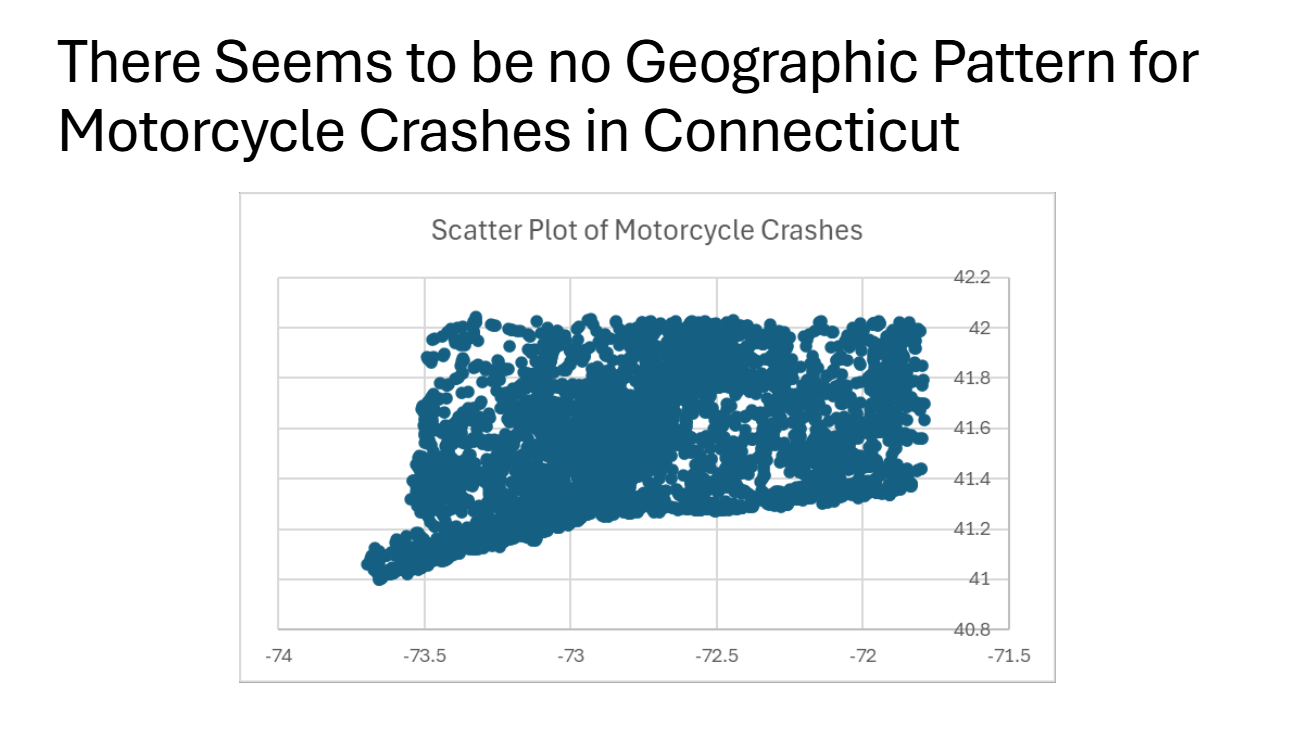
(Scatter plot using Latitude × Longitude)
Why This Question Is Interesting
Mapping crashes helps identify hotspots where environmental features, intersections, or traffic flow might increase crash risk. Geographic patterns can guide highway improvements and targeted enforcement.
How We Used Excel
We plotted every crash using its latitude and longitude, creating a two-dimensional scatter plot. We kept point size small to highlight dense clusters.
How We Developed the Visual
We removed gridlines, added state outline boundaries for context, and adjusted transparency so dense areas were more visible.